Bom dia, Márcia! Como está?
Incrível! Continue resolvendo os desafios e compartilhando com a comunidade Alura.
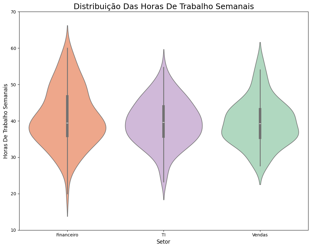
Notei que você utilizou o violinplot com a variável hue para segmentar os dados por setor, aplicou de forma eficaz o parâmetro palette para tornar a visualização mais intuitiva e compreendeu a importância do ajuste de ylim para focar nas faixas mais relevantes de horas semanais.
Um próximo passo interessante seria explorar o uso do parâmetro split=True para sobrepor as distribuições quando houver apenas duas categorias no hue. Veja o exemplo:
sns.violinplot(data=df, y='Horas de Trabalho Semanais', x='Setor', hue='Setor', palette='pastel', split=True)
Resultado: Violinplot com as distribuições sobrepostas lado a lado, facilitando a comparação entre os setores.
Isso permite visualizar as diferenças entre as categorias de forma mais compacta, o que pode ser muito útil para análises comparativas.
 Para saber mais:
Sugestão de conteúdo para você mergulhar ainda mais sobre o tema:
Alguns materiais estão em inglês, mas é possível compreendê-los usando o recurso de tradução de páginas do próprio navegador.
Fico à disposição! E se precisar, conte sempre com o apoio do fórum.
Abraço e bons estudos!
 Conte com o apoio da comunidade Alura na sua jornada. Abraços e bons estudos!