
Opa, tudo bem?
Estava fazendo o projeto e tive que fazer algumas mudanças porque o código estava quebrando pra mim. Está tudo ocorrendo bem, mas quando eu adiciono as outras menu__lista o menu quebra em várias colunas, sendo que deveriam ficar um embaixo da outra.
sem adicionar as outras menu__lista: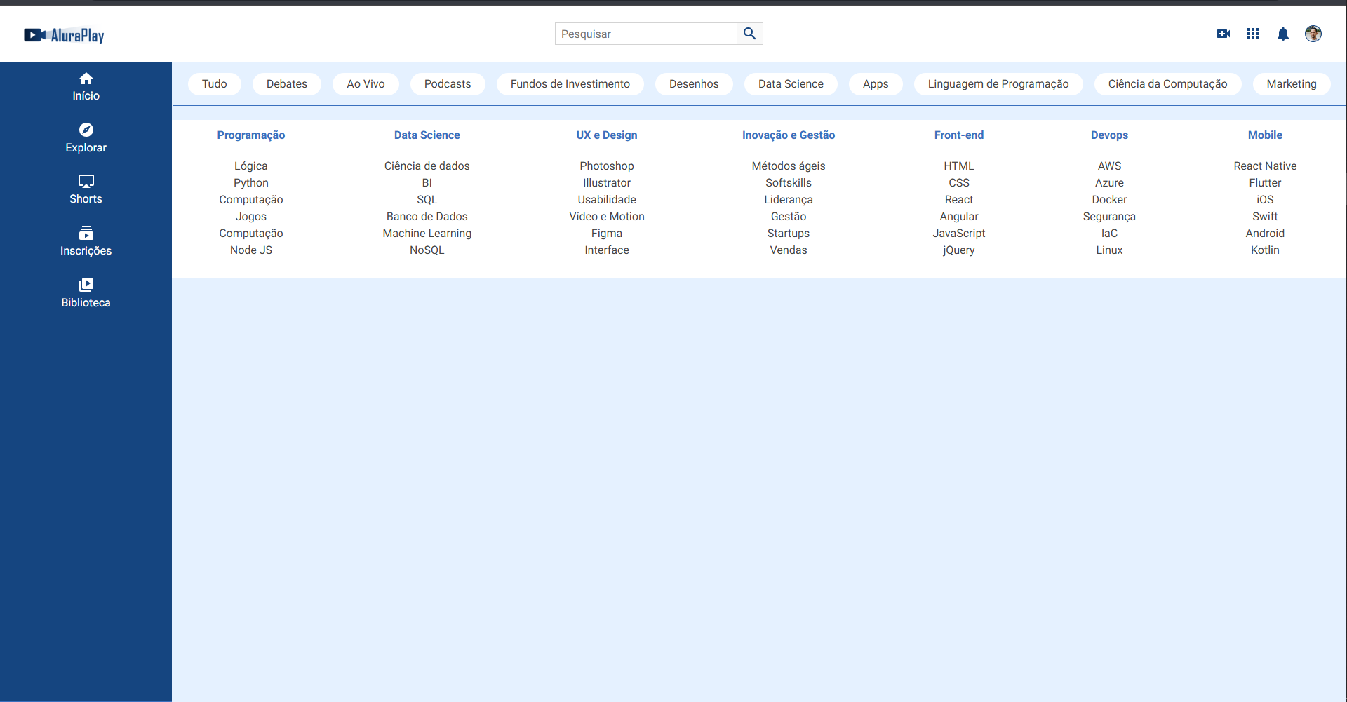
adicionando: 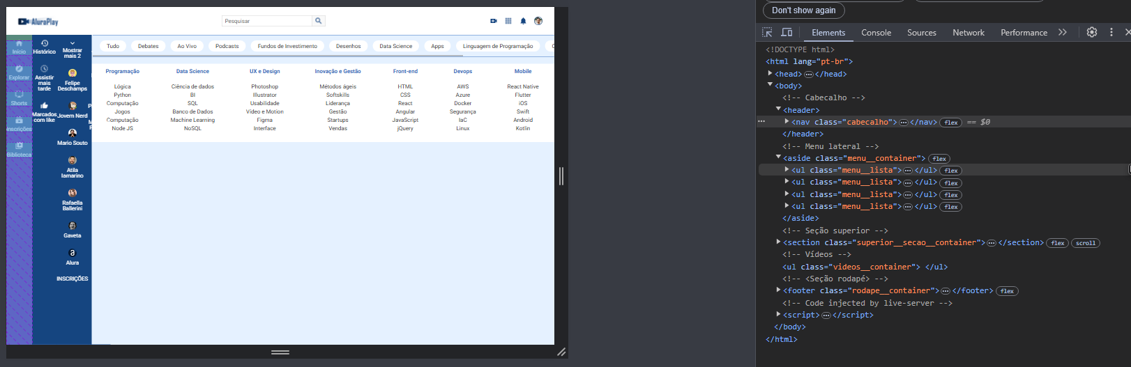
código css:
.cabecalho {
    display: flex;
    justify-content: space-between;
    align-items: center;
    position: fixed;
    top: 0;
}

.cabecalho_pesquisa {
    display: none;
}

.menu__container {
    display: flex;
    position: fixed;
    bottom: 0;
    height: 4.62rem;
    width: 100%;
}

.menu__lista {
    display: flex;
    gap: 30px;
    width: 100%;
    align-self: center;
    justify-content: space-around
}

.menu__lista li {
    align-self: center;
}

.menu__lista:nth-child(2),
.menu__lista:nth-child(3),
.menu__lista:nth-child(4) {
    display: none;
}

.menu__itens {
    display: flex;
    flex-direction: column;
    gap: 5px;
}

.superior__secao__container {
    display: flex;
    align-items: center;
    white-space: nowrap;
    overflow: scroll;
    gap: 0.90rem;
}

.rodape__container {
    display: flex;
    flex-direction: column;
    flex-wrap: wrap;

}

@media (min-width: 834px) {

    /* CABEÇALHO */
    .cabecalho_pesquisa {
        display: block;
    }

    /* RODAPÉ */
    .rodape__container {
        justify-content: space-between;
    }
}

@media (min-width: 1440px) {

    .menu__container {
        left: 0;
        width: 245px;
        height: auto;
        top: 80px

    }

    .menu__lista {
        flex-direction: column;
        justify-content: flex-start;
        padding-top: 15px;
        height: 100%;

    }

    .menu__lista:nth-child(2),
    .menu__lista:nth-child(3),
    .menu__lista:nth-child(4) {
        display: flex;
        flex-direction: column;
    }

}

@media (min-width: 1880px) {
    .superior__secao__container {
        overflow: hidden;
        justify-content: space-around;
    }
}

