
Estou com esse problema, meu responsivo nao ocupa 100% da tela, mesmo o media querry estando no tamanho correto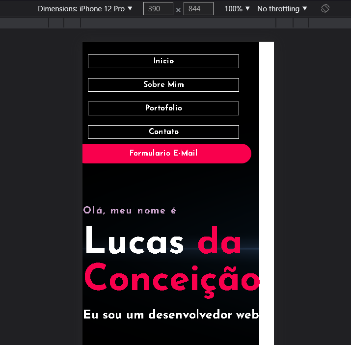 , alguem já passou por isso ?
Segue codigo do @media
media screen and (max-width: 390px) {
* {
    overflow: hidden;
    padding: 0;
    margin: 0;
    font-family: 'Josefin Sans', sans-serif;
    box-sizing: border-box;
}

nav {
    padding: 1em;
    display: flex;
    flex-direction: column;
    align-items: initial;
    text-align: center;

}

nav h2 {
    display: none;
}


.cabeçalho-link li {
    display: flex;
    flex-direction: column;
    align-items: initial;
    text-align: center;
}

.cabeçalho-link a {
    padding: 5px;
    border: 1px solid white;
}

.Main {
    width: 100vw;
    margin-top: 10em;
    display: flex;
    flex-direction: column;
    text-align: start;


}

.background {
    background-image: url(teste.png);
    min-width: 100vw;

}


.habilidades-lista {
    display: flex;
    flex-direction: row;
    width: 100%;

}

.habilidades-titulo {
    width: 100%;
    font-size: 20px;
}

.habilidades img {

    width: 100px;
}


.background-color-Sobre {
    padding: 1em 0px 0px 0px;
    width: 100vw;
    height: 100%;
}

.main-sobre {

    display: flex;
    flex-direction: column;
}

.main-sobre img {
    border-radius: 100%;
    box-shadow:         9px 7px 5px rgba(50, 50, 50, 0.77);
    padding: 1em;
    margin-right: 66%;
    width: 100vw;


}

.Text-sobre{
 width: 100%;
 flex-wrap: wrap;
}

.Text-sobre h2 {
    font-size: 32px;
    margin-left: 3.5em;
}
.Text-sobre h5 {
    font-size: 24px;
    margin-left: 1em;
}

.Text-sobre p {
    text-align: center;
    width: 100vw;
    font-size: 16px;

}

.Text-sobre button {
    width: 100vw;
}

.contato {

}
}

