
Olá Prezados Bom Dia,
Estou com uma certa dificuldade em questão na responsividade para telas de tablet. Poderia me ajudar por favor ? Este projeto não se trata de uma atividade de vcs! É apenas uma projeto ficticio meu mesmo! Estou com uma certa dificuldade em questão na responsividade para telas de tablet. Poderia me ajudar por favor ? Este projeto não se trata de uma atividade de vcs! É apenas uma projeto ficticio meu mesmo! Abaixo segue os código CSS junto a imagens
(https://cdn1.gnarususercontent.com.br/1/1419795/c6765564-d1b8-4adf-b1cd-9409c398d463.png)(https://cdn1.gnarususercontent.com.br/1/1419795/e398468d-691f-43c4-bb0f-dcdb9254fbe5.png)
body{
    height: 100%;
    margin: 0;
}
*{
    margin: 0;
    padding: 0;
    box-sizing: border-box;
    font-family: Arial, Helvetica, sans-serif;
}
.Corpo{
    background-color: rgba(105, 105, 105, 1);
}
header{
    padding: 20px 0;
}
.Menu{
    padding-top: 0px;
    width: 100%;
    text-align: left;
    font-size: 20px;
}
.Menu a{
    color: white;
    text-decoration: none;
    font-weight: bold;
    margin-left: 15px;
    background-color: dodgerblue;
    padding: 10px;
}
.Titulo{
    text-align: center;
    font-size: 30px;
    padding: 30px;
    color: white;
}
.texto__jogo{
    padding: 10%;
    color: white;
    font-size: 20px;
    display: inline-block;
    justify-content: space-between;
}
.imagem__amostra{
    width: 20%;
    height: 20%;
    border-radius: 15px;
    padding-top: 5%;
    justify-content: space-between;
    margin: 0px 15% 0px 0px;
    float: right;
}
.imagem__amostra2{
    width: 20%;
    height: 20%;
    border-radius: 15px;
    padding-top: 5%;
    justify-content: space-between;
    margin: 0px 0px 0px 10%;
    float: left;
}
header {
    display: flex;
    justify-content: center;
    padding-top: 5%;
}
.menu {
    display: flex;
    align-items: left;
}
.titulo__jogo {
    margin-right: 10px;
}
.texto__jogo2{
    background-color: white;
    color: rgb(105, 105, 105, 1);
    border-radius: 5px;
    padding: 10px;
    margin-top: 15px;
    border-radius: 5px;
    width: 100%;
    align-items: center;
    border: none;
    float: left;
    justify-content: space-between;
    font-size: 15px;
}
.Iniciar__jogo {
    color: white;
    text-decoration: none;
    border-radius: 5px;
    padding: 10px;
    margin-top: 15px;
    width: 100%;
    border: none;
    float: right;
    justify-content: space-between;
    background-color: dodgerblue;
    text-align: center;
    font-size: 15px;
}
@media screen and (max-width: 414px){
    .Menu{
        padding-top: 15px;
        width: 100%;
        text-align: left;
        font-size: 15px;
    }
    .imagem__amostra{
        width: 50%;
        height: 50%;
        border-radius: 15px;
        padding-top: 5%;
        margin: 0px 25% 0px 0px;
        float: right;
    }
    .imagem__amostra2{
        width: 50%;
        height: 50%;
        border-radius: 15px;
        padding-top: 5%;
        justify-content: space-between;
        margin: 0px 0px 0px 25%;
        float: left;
    }
    header {
        display: inline-block;
        justify-content: center;
        padding-top: 5%;
    }
    .texto__jogo2{
        justify-content: space-between;
        font-size: 10px;
        margin-left: 83px;
    }
    .Iniciar__jogo {
        color: white;
        text-decoration: none;
        border-radius: 5px;
        padding: 10px;
        margin-top: 15px;
        width: 100%;
        margin-left: 40%;
        border: none;
        background-color: dodgerblue;
        text-align: center;
        font-size: 10px;
    }
}
@media screen and (max-width: 375px){
    .texto__jogo2{
        margin-left: 67px;
    }
}
@media screen and (max-width: 320px){
    .texto__jogo2{
        margin-left: 43px;
    }
}


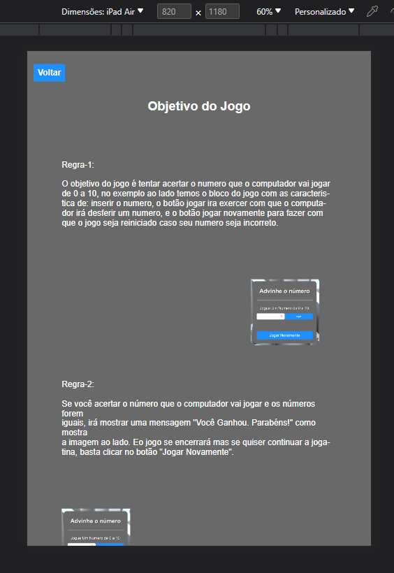
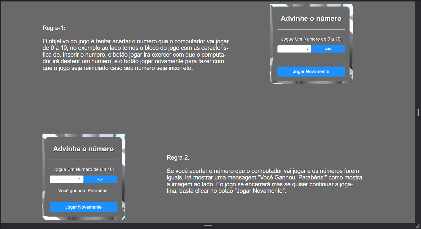 Na foto acima é como deve ficar, porém ele está ficando igual a imagem abaixo!
 Meu HTML: