
Dúvidas:
Foram utilizados esses elementos, mas é a primeira vez que citam eles. Como funcionam:
a) justify-content: space-between;
b) flex-wrap: wrap;
c) "tag div"
Resolução:
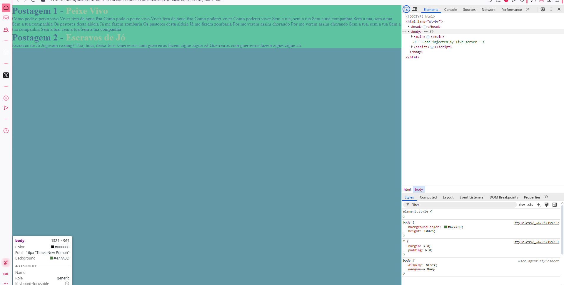
1 - Ajustando a altura da tela com CSS
CSS:
* {

    margin: 0;
    padding: 0;
}

body {

    background-color: #477A3D;
    height: 100vh;
}

main {

    background-color: #29FA00;
}

h1 {

    color: black;
}

.titulo-blog {

    color: #FAF900;
}
Teste:
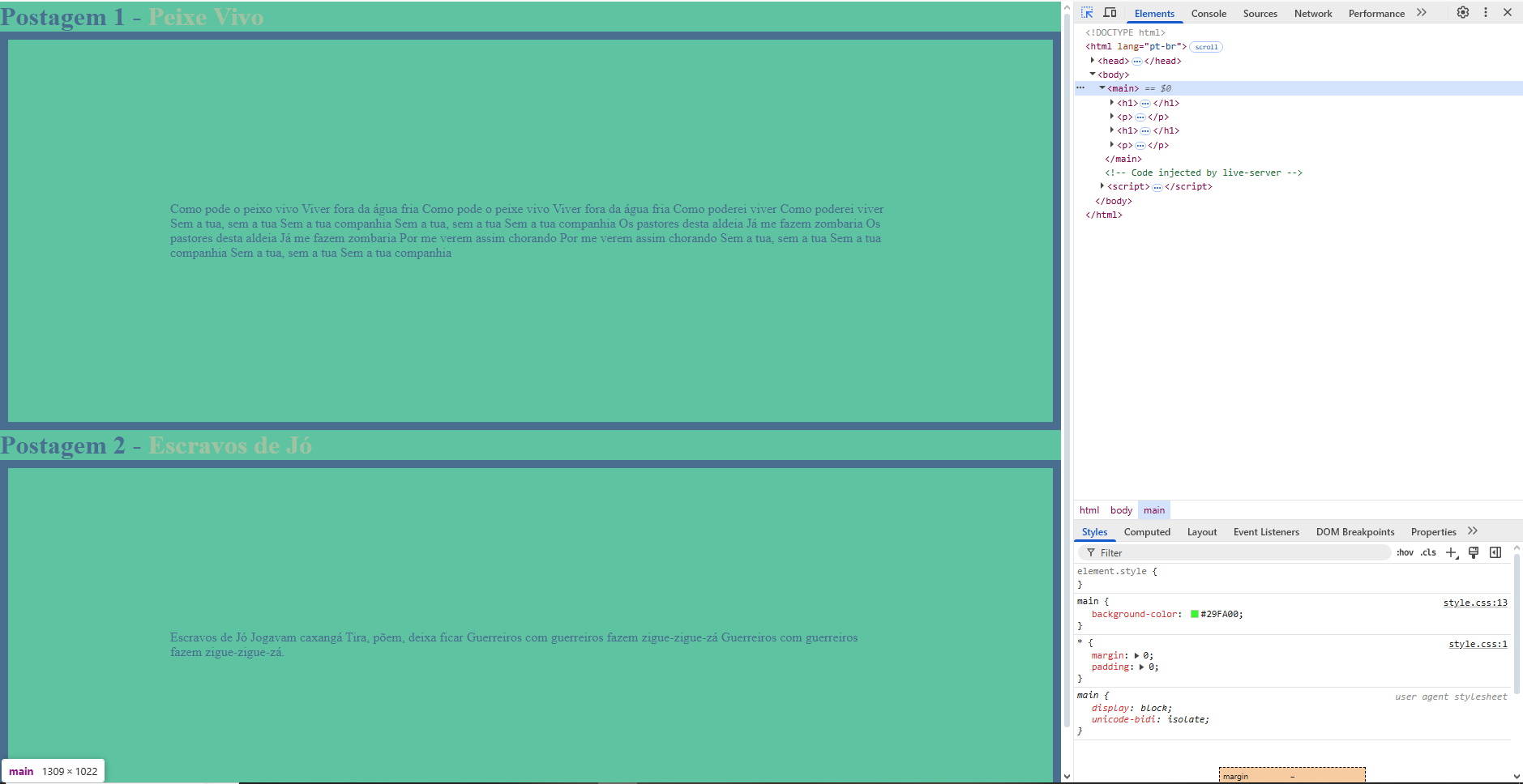
2 - Controlando o tamanho de elementos com Box Sizing
CSS:
p {

    border: 10px solid;
    padding: 200px;
}

body {

    background-color: #477A3D;
    height: 100vh;
    box-sizing: box-border;
}
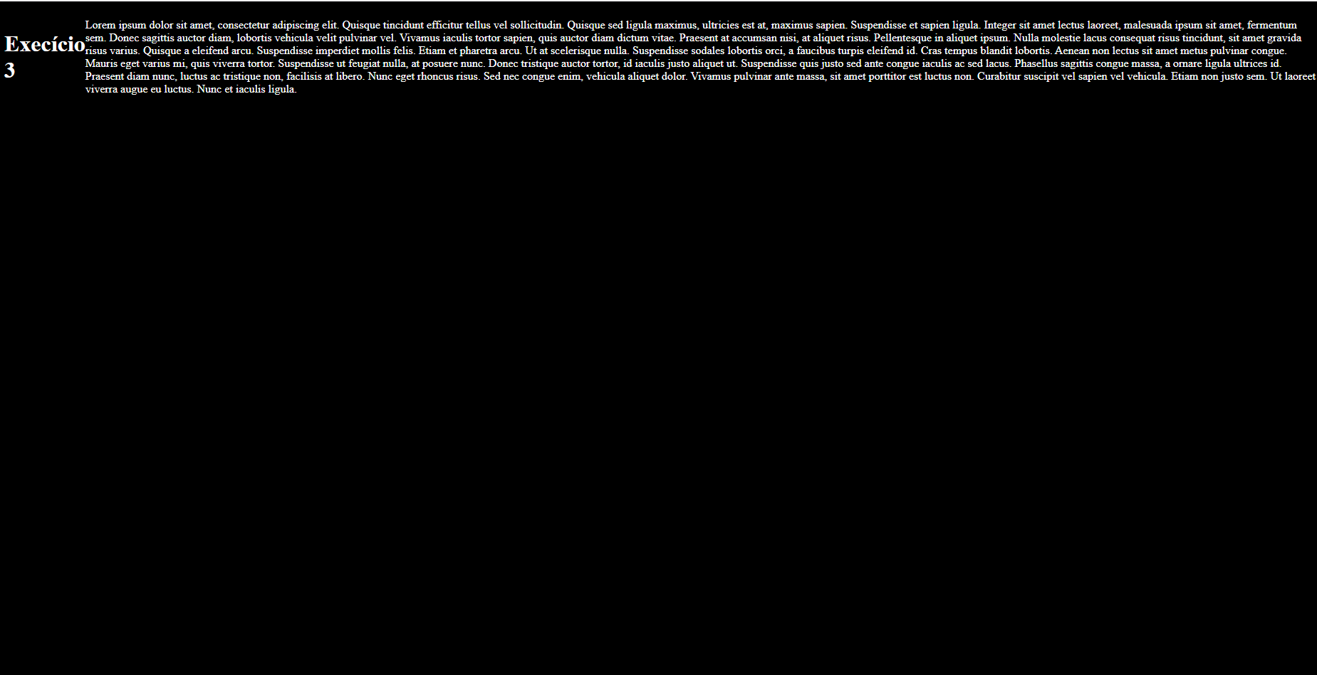
3 - Criando um layout sem scroll
CSS:
body {

    background-color: #000000;
    color: white;
    height: 100vh;

}

.presentation {

    display: flex;
    flex-direction: row;
    align-items: center;
}
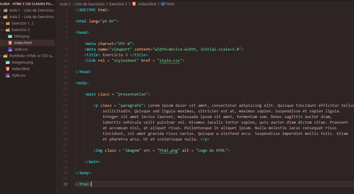
4 - Flexbox: alinhando textos e imagens
CSS:
body {

    background-color: #000000;
    color: white;
    height: 100vh;

}

.presentation {

    display: flex;
    flex-direction: row;
    align-items: center;
    justify-content: space-between;
}
HTML:
5 - Flexbox: Centralização vertical
CSS:
.presentation {

    display: flex;
    flex-direction: row;
    align-items: center;
    justify-content: space-between;
}
6 - Flexbox: responsividade e alinhamento
CSS:
body {

    background-color: #000000;
    color: white;
    height: 100vh;
    box-sizing: border-box;

}

.presentation {

    display: flex;
    flex-direction: column;
    align-items: center;
    justify-content: space-between;
    flex-wrap: wrap;
}


 Para saber mais: