
Gitpag:https://aebombom.github.io/AluraBooks-Estudos-Alura/
Repositório:https://github.com/Aebombom/AluraBooks-Estudos-Alura/blob/main/README.md
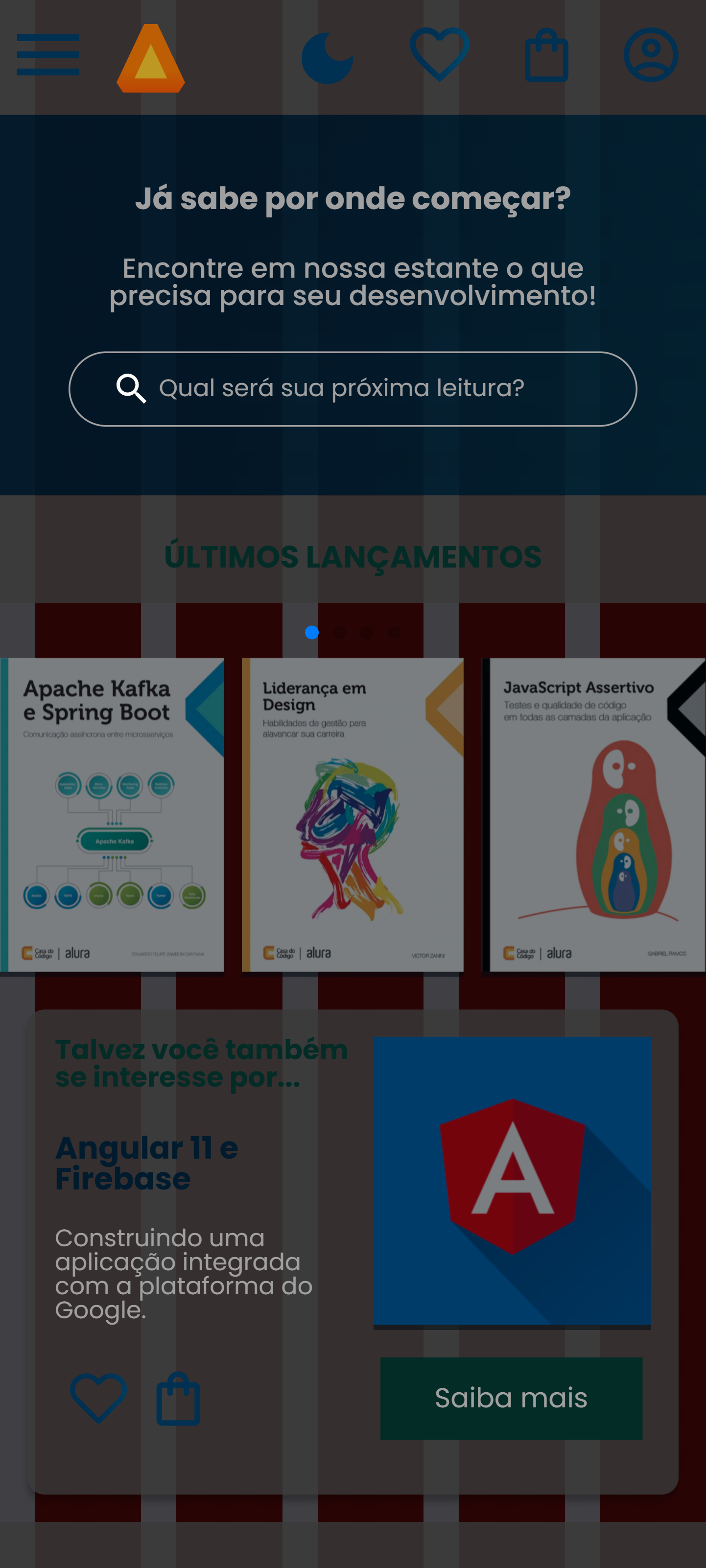
Para manter esse projeto mais semelhante ao do figma, useibackground: linear-gradient , porém adicionei ao projeto um dark mode (ensinado no conteúdo extra: Dark Mode: um projeto em HTML/CSS) e para manter a fluidez na hora da transição de modos tive que usar a regra @property:
@property --cor--fundo-1 {
  syntax: "<color>";
  inherits: false;
  initial-value: #ebecee;
}

@property --cor--fundo-2 {
  syntax: "<color>";
  inherits: false;
  initial-value: #e6c7c7;
}
Também adicionei uma animação do botão de favorito (ensinado no conteúdo extra: Animação de coração: um projeto em HTML/CSS) usando @keyframes, input checkbox e :checked.
HTML

<input type="checkbox" id="favoritos-1" class="botoes__favoritos" />
<label for="favoritos-1">
  <svg
    width="35"
    height="32"
    viewBox="0 0 24 22"
    fill="none"
    class="botoes__itens"
    xmlns="http://www.w3.org/2000/svg"
  >
    <path
      d="M20.8397 3.49592C20.329 2.98492 19.7226 2.57957 19.0551 2.303C18.3876 2.02644 17.6722 1.88409 16.9497 1.88409C16.2273 1.88409 15.5118 2.02644 14.8444 2.303C14.1769 2.57957 13.5705 2.98492 13.0597 3.49592L11.9997 4.55592L10.9397 3.49592C9.90805 2.46423 8.50877 1.88463 7.04974 1.88463C5.5907 1.88463 4.19143 2.46423 3.15974 3.49592C2.12805 4.52761 1.54845 5.92689 1.54845 7.38592C1.54845 8.84495 2.12805 10.2442 3.15974 11.2759L4.21974 12.3359L11.9997 20.1159L19.7797 12.3359L20.8397 11.2759C21.3507 10.7652 21.7561 10.1587 22.0327 9.49127C22.3092 8.82382 22.4516 8.10841 22.4516 7.38592C22.4516 6.66343 22.3092 5.94802 22.0327 5.28056C21.7561 4.61311 21.3507 4.00668 20.8397 3.49592V3.49592Z"
      stroke="url(#paint0_linear_611_513)"
      stroke-width="2"
      stroke-linecap="round"
      stroke-linejoin="round"
    />
    <defs>
      <linearGradient
        id="paint0_linear_611_513"
        x1="14.6952"
        y1="-3.84001"
        x2="64.9448"
        y2="3.41189"
        gradientUnits="userSpaceOnUse"
      >
        <stop stop-color="#002F52" />
        <stop offset="1" stop-color="#326589" />
      </linearGradient>
    </defs>
    />
  </svg>
</label>
CSS

.botoes__favoritos:checked + label > svg {
  animation: preencher;
  animation-duration: 0.5s;
  animation-fill-mode: forwards;
}

@keyframes preencher {
  0% {
    fill: transparent;
  }
  50% {
    fill: url(#paint0_linear_611_513);
    transform: scale(1.1);
  }
  100% {
    fill: url(#paint0_linear_611_513);
  }
}