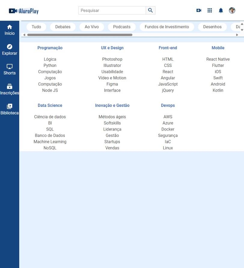

CSS
/* CABEÇALHO */

.cabecalho__container {
    display: flex;
    justify-content: space-between;
    align-items: center;
    position: fixed;
    top: 0;
}

.cabecalho__pesquisar__item {
    display: none;

}

/* MENU */

.menu__container {
    position: fixed;
    bottom: 0%;
    height: 74px;
    width: 100%;
}

.menu__lista {
    display: flex;
    justify-content: space-around;
    height: 100%;
}

.menu__lista li {
    align-self: center;
}

.menu__itens {
    display: flex;
    flex-direction: column;
    gap: 5px;
}

.menu__lista:nth-child(2),
.menu__lista:nth-child(3),
.menu__lista:nth-child(4) {
    display: none;
}

/* SUPEIOR SEÇÃO */

.superior__secao__container {
    display: flex;
    align-items: center;
    white-space: nowrap;
    overflow: scroll;
    gap: 15px;
}

/* RODAPÉ */

.rodape__container {
    display: flex;
    /*flex-direction: column;
    flex-wrap: wrap;*/
    flex-flow: column wrap;
}

@media (min-width: 834px) {

    /* CABEÇALHO */

    .cabecalho__pesquisar__item {
        display: block;
    }

    /* MENU LATERAL PARA TELAS DE TABLETS */

    .menu__container {
        left: 0;
        height: auto;
        width: 74px;
        top: 80px;
    }

    .menu__lista {
        flex-direction: column;
        justify-content: flex-start;
        padding-top: 15px;
        gap: 33px;
    }

    }
    /* RODAPÉ */

    .rodape__container {
        justify-content: space-between;
    }
MENU PARA TABLET