Você está vendo a versão anterior da nova experiência da Alura que estamos preparando para você. Em breve, ela ganha uma identidade visual novinha totalmente pensada em potencializar seus estudos!


Bom dia, Edilson! Tudo bem?
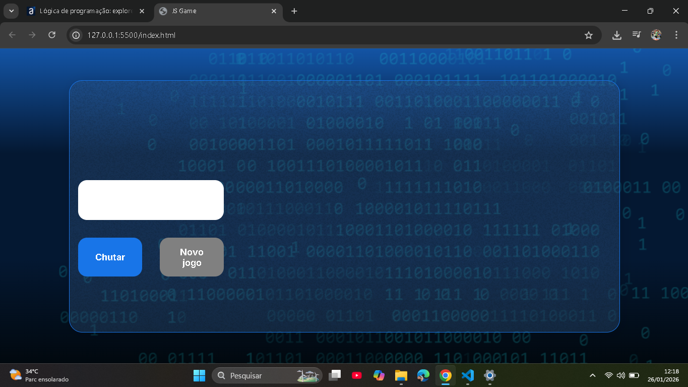
Fiz alguns ajustes no código do arquivo style.css para que a imagem ainda aparece no seu monitor com a resolução normal, sem a necessidade de tirar zoom.
* {
    box-sizing: border-box;
    margin: 0;
    padding: 0;
    color: white;
}

body {
    background: linear-gradient(#1354A5 0%, #041832 33.33%, #041832 66.67%, #01080E 100%);
    height: 100vh;
    display: flex;
    align-items: center;
    justify-content: center;
}


body::before {
    background-image: url("img/code.png");
    background-repeat: no-repeat;
    background-position: right;
    content: "";
    display: block;
    position: absolute;
    width: 100%;
    height: 100%;
    opacity: 0.4;
}

.container {
    width: 80%;
    height: 80%;
    display: flex;
    align-items: center;
    justify-content: center;
    border-radius: 24px;
    border: 1px solid #1875E8;
    box-shadow: 4px 4px 20px 0px rgba(1, 8, 14, 0.15);
    background-image: url("img/Ruido.png");
    background-size: 100% 100%;
    position: relative;
}


.container__conteudo {
    display: flex;
    align-items: center;
    justify-content: space-between;
    width: 100%;
}

.container__informacoes {
    flex: 1;
    padding: 3rem;
}

.container__botao {
    border-radius: 16px;
    background: #1875E8;
    padding: 16px 24px;
    width: 100%;
    font-size: 24px;
    font-weight: 700;
    border: none;
    margin-top: 2rem;
}

.container__imagem-pessoa {
    max-width: 40%;
    height: auto;
    flex-shrink: 0;
}

.container__texto {
    margin: 16px 0 16px 0;
}

.container__texto-azul {
    color: #1875E8;
}

.container__input {
    width: 100%;
    height: 72px;
    border-radius: 16px;
    background-color: #FFF;
    border: none;
    color: #1875E8;
    padding: 2rem;
    font-size: 24px;
    font-weight: 700;
    font-family: 'Inter', sans-serif;
}

.container__botoes {
    display: flex;
    gap: 2em;
}

h1 {
    font-family: 'Chakra Petch', sans-serif;
    font-size: 72px;
    padding-bottom: 3rem;
}

p,
button {
    font-family: 'Inter', sans-serif;
}

.texto__paragrafo {
    font-size: 32px;
    font-weight: 400;
}

button:disabled {
    background-color: gray;
}

@media screen and (max-width: 1250px) {

    h1 {
        font-size: 50px;
    }

    .container__botao {
        font-size: 16px;
    }


    .texto__paragrafo {
        font-size: 24px;
    }


    .container__conteudo {
        flex-direction: row;
        gap: 2rem;
    }

    .container__imagem-pessoa {
        max-width: 60%;
    }

    .container__informacoes {
        padding: 1rem
    }
}
Como foram vários pontos, não vou descrever diretamente todos, mas no geral eu apliquei uma configuração na classe da imagem para ajustar o tamanho dela quando a tela ficar menor e não simplesmente sumir como antes.
Espero ter ajudado e bons estudos!