
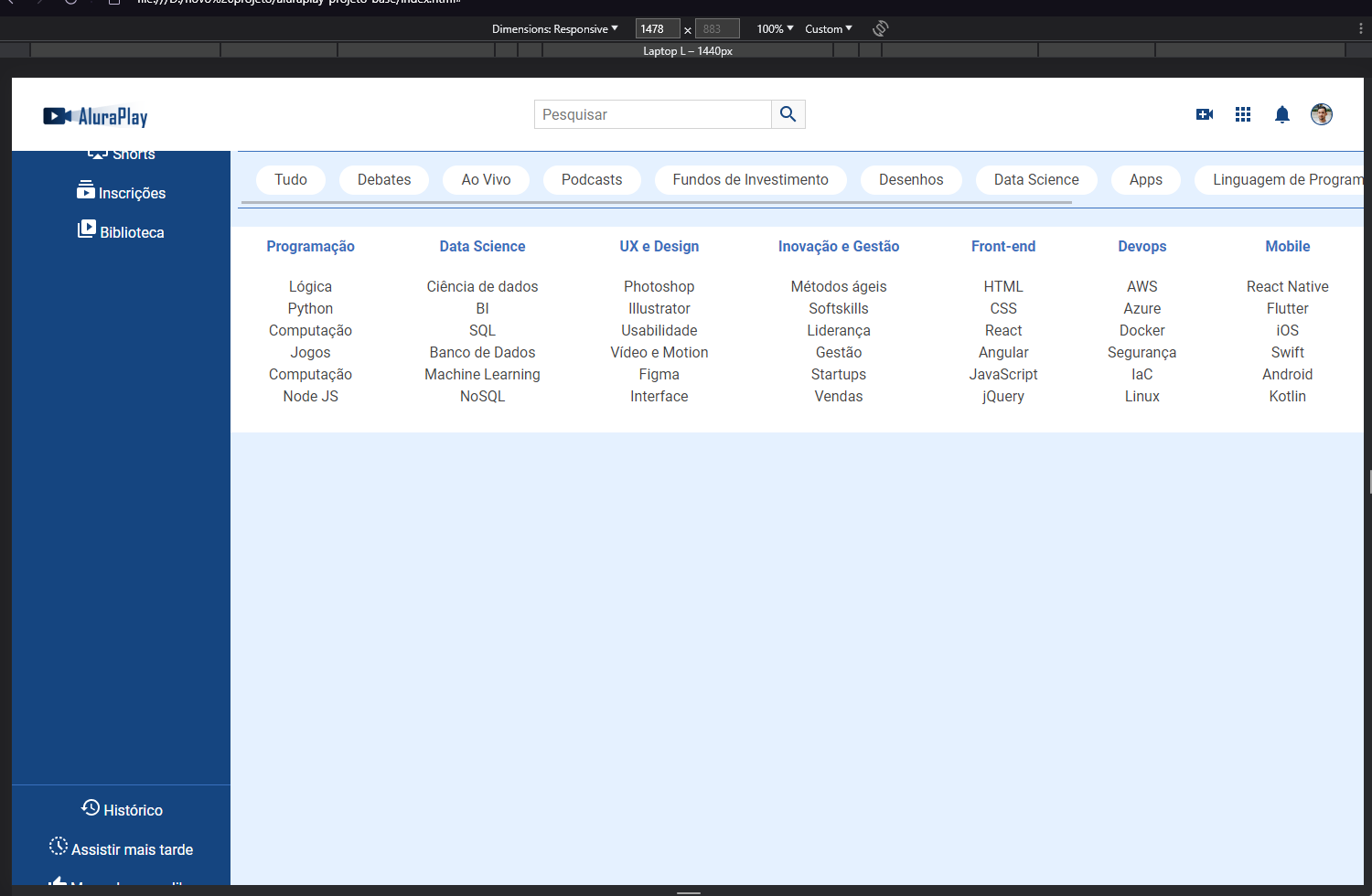
meu menu está ficando separado um do outros as listas
/* CABEÇALHO */
.cabecalho__container { display: flex; justify-content: space-between; align-items: center; position: fixed; top: 0; }
.cabecalho__pesquisar__item { display: none;
}
/* MENU */
.menu__container{ position: fixed; bottom: 0%; height: 74px; width: 100%;
}
.menu__lista { display: flex; justify-content: space-around; height: 100%;
}
.menu__lista li { align-self: center;
}
.menu__item { display: flex; flex-direction: column; gap: 5px;
}
.menu__lista:nth-child(2), .menu__lista:nth-child(3), .menu__lista:nth-child(4) { display: none;
}
/* SUPERIOR */
.superior__secao__container { display: flex; align-items: center; white-space: nowrap; overflow: scroll; gap: 15px;
}
/* RODAPÉ */
.rodape__container { display: flex; /*flex-direction: column; flex-wrap: wrap; isso é a mesma coisa que de baixo, o primeiro é direção e o segundo para fazer uma quebra na coluna */ flex-flow: column wrap;
}
@media (min-width: 834px) {
/* CABEÇALHO */

.cabecalho__pesquisar__item {
    display: block;

}

/* RODAPÉ */

.rodape__container {
    justify-content: space-between;

}

    /* MENU LATERAL PARA TELAS DE TABLETS */

.menu__container {
    left: 0;
    height: auto;
    width: 74px;
    top: 80px;
}

.menu__lista {
    flex-direction: column;
    justify-content: flex-start;
    padding-top: 15px;
    gap: 20px;
}
}
@media (min-width: 1440px) {
.menu__container {
    width: 239px;
    overflow: scroll;

}

.menu__lista:nth-child(2),
.menu__lista:nth-child(3),
.menu__lista:nth-child(4) {
display: flex;

}

.menu__item {
    height: auto;
    padding: 20px 17px 20px 15px;


}
}