
HTML:
<!DOCTYPE html>
<html lang="pt-br">
<head>
<meta charset="UTF-8">
<meta http-equiv="X-UA-Compatible" content="IE=edge">
<meta name="viewport" content="width=device-width, initial-scale=1.0">
<title>Portfolio</title>
<link rel="stylesheet" href="style.css">
</head>
<body>
<header></header>
<main class="apresentacao">
<section class="apresentacao__conteudo">
<div class="conteudo">
<div class="texto">
<h1 class="apresentacao__conteudo__titulo">Isabel Trindade Araújo</h1>
<h2> Estudante de <strong class="titulo-blog">Desenvolvimento Front-end</strong></h2>
<p class="apresentacao__conteudo__texto" sou estudante apaixonada por desenvolvimento front-end, com foco em <strong class="texto-destaque">REACT, HTML e CSS</strong>. Busco criar interfaces web modernas, responsivas e intuitivas, sempre focando em uma experiência de usuário de alta qualidade. Atualmente, estou participando do ONE - Oracle Next Education, onde estou aprimorando meus conhecimentos em tecnologias e práticas de desenvolvimento de software. Estou empolgada para aplicar tudo o que aprendi em projetos desafiadores e inovadores.</p>
<a href="https://www.instagram.com/isabeltr_">Instagram</a>
<a href="https://github.com/IsabelTr">GitHub</a>
</section>
</div>
<div class="imagem">
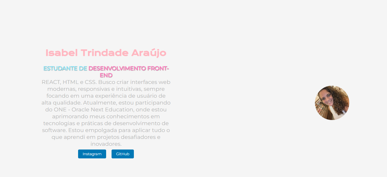
<img src="imagemisabel.jpeg" alt="minha" class="imagem-circular">
</div>
</div>
</main>
<footer></footer>
</body>
</html>
CSS:
@import url('https://fonts.googleapis.com/css2?family=Krona+One&family=Montserrat&display=swap');
/* Reset básico de margens e padding */
* {
    margin: 0;
    padding: 0;
}

body {
    box-sizing: border-box;
    background-color: #F5F5F5;
    height: 100%;
    margin: 0;
    overflow: hidden;
    font-family: 'Montserrat', sans-serif;
}
h1 {
    font-weight: bold;
    color: #FFB6C1;
    text-align: center;
    margin: 30px 0;
}

h2 {
    color: #8BE9FD;
    font-size: 24px;
    text-align: center;
    font-weight: bold;
    text-transform: uppercase;
    text-shadow: 1px 1px 2px rgba(0, 0, 0, 0.5);
}

.titulo-blog {
    color: #FF79C6;
    font-weight: bolder;
}

p {
    color: #B5B5B5;
}

.texto-destaque {
    color: #FF79C6;
    font-weight: bold;
    background-color: white;
    padding: 0 5px;
    border-radius: 5px;
}
.manchete-urgente {
    color: #ff0000;
    font-weight: bold;
    font-size: 1.5em;
    text-transform: uppercase;
    margin-right: 10px;
}
.imagem-circular {
    width: 150px;
    height: 150px;
    border-radius: 50%;
    object-fit: cover;
}
.apresentacao {
    margin: 10%;
    display: flex;
    align-items: center;
    justify-content: space-between;
}
.apresentacao__conteudo {
    width: 615px;
}

.apresentacao__conteudo__titulo {
    font-size: 36px;
    font-family: 'Krona One', sans-serif;
}

.apresentacao__conteudo__texto {
    font-size: 24px;
    font-family: 'Montserrat', sans-serif;
}

.conteudo {
    display: flex;
    justify-content: space-between;
    align-items: center;
    width: 100%;
    flex-wrap: wrap;
}

.texto {
    flex: 1;
    margin-right: 10px;
    text-align: center;
    padding: 20px;
}

.imagem {
    flex-shrink: 0;
    margin-top: 20px;
    display: flex;
    justify-content: center;
    align-items: center;
}

a {
    display: inline-block;
    padding: 10px 20px;
    margin: 10px;
    color: white;
    background-color: #0077b5;
    text-decoration: none;
    border-radius: 5px;
    transition: background-color 0.3s;
}

a:hover {
    background-color: #005582;
}

@media (max-width: 768px) {
    .conteudo {
        flex-direction: column;
        align-items: center;
    }

    .texto {
        margin-right: 0;
        margin-bottom: 20px;
        text-align: center;
    }

    .imagem {
        margin-top: 20px;
        margin-bottom: 20px;
    }

    .imagem-circular {
        width: 120px;
        height: 120px;
    }
}

@media (max-width: 480px) {
    h1 {
        font-size: 1.5em;
    }

    h2 {
        font-size: 1.2em;
    }

    .texto {
        font-size: 0.9em;
    }

    .imagem-circular {
        width: 100px;
        height: 100px;
    }
}


 Conte com o apoio da comunidade Alura na sua jornada. Abraços e bons estudos!