Você está vendo a versão anterior da nova experiência da Alura que estamos preparando para você. Em breve, ela ganha uma identidade visual novinha totalmente pensada em potencializar seus estudos!
 Solucionado


Oi Joao, tudo bem?
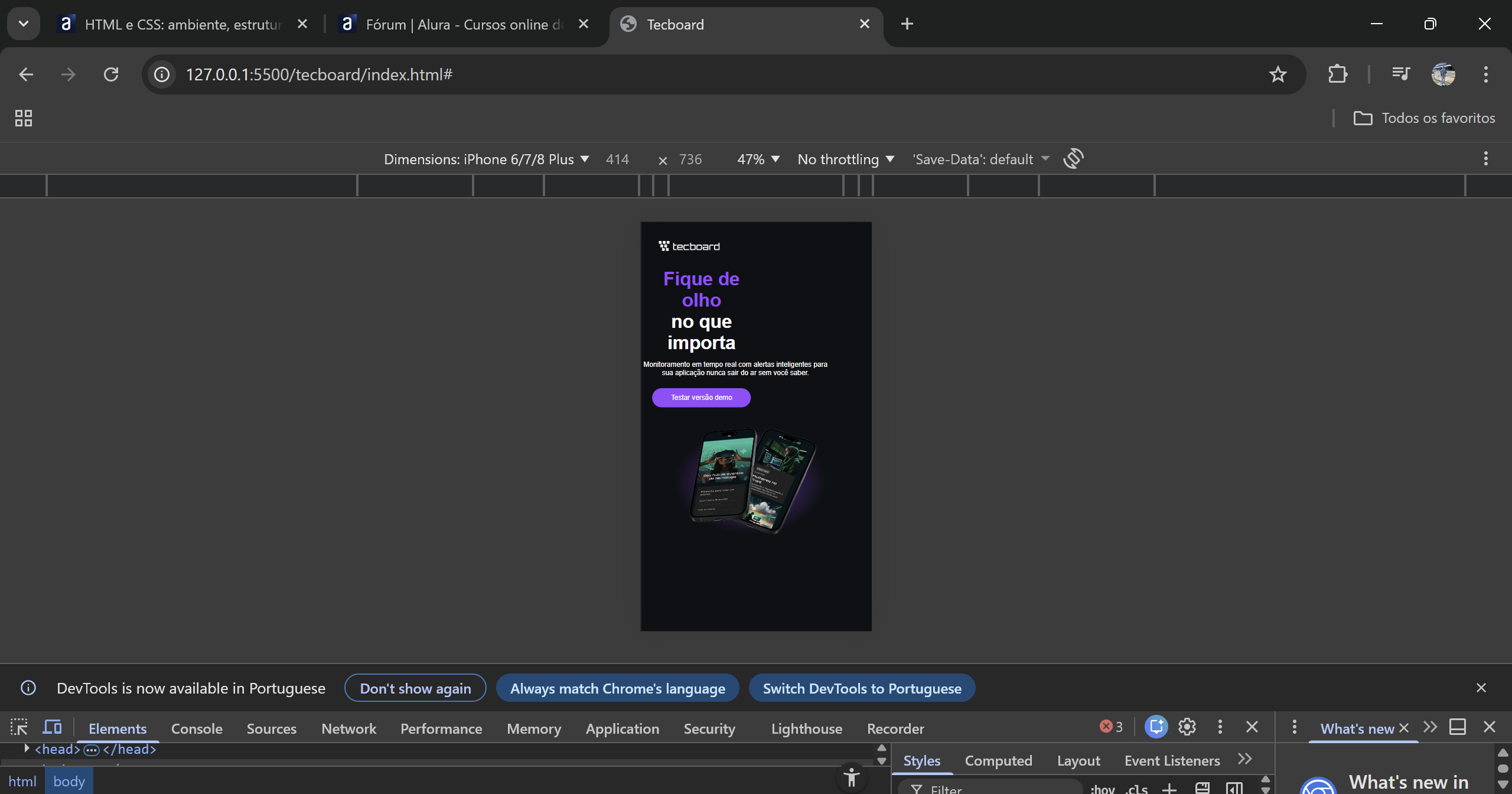
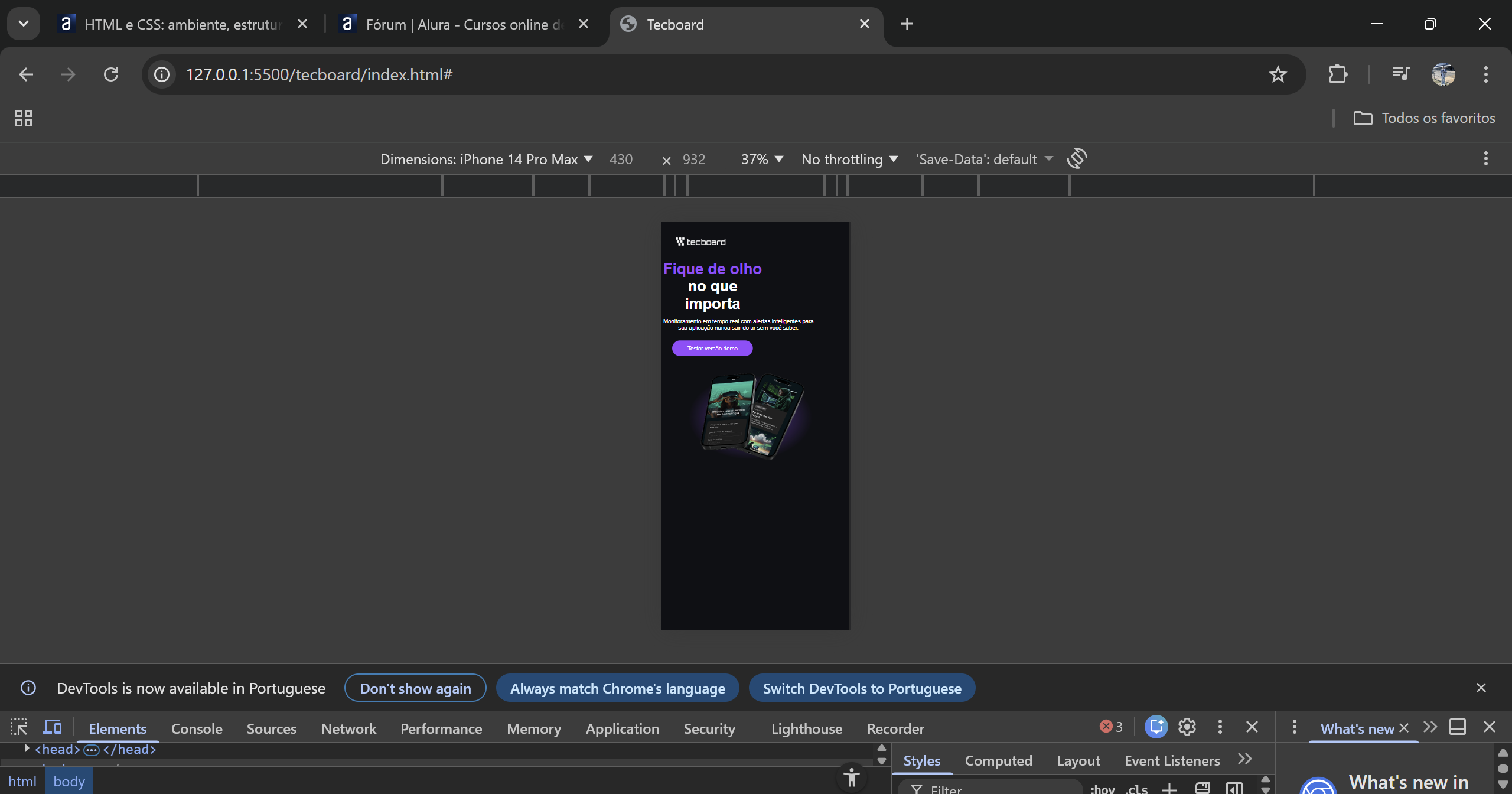
Muito bom você testar o projeto em diferentes telas no DevTools! Esse é um hábito excelente no Front-end.
O código da professora funciona super bem e resolve o layout perfeitamente para os tamanhos de tela mais tradicionais (como 375px e 768px). O detalhe aí é que celulares mais novos, como o iPhone 14 Pro Max, possuem telas um pouco mais largas (na faixa de 430px). Como eles passam do limite de 375px, acabam caindo na regra de tablet e puxando as medidas maiores, o que faz o conteúdo vazar.
Para melhorar isso e deixar o projeto 100% adaptável a qualquer aparelho, a dica é trocar as larguras fixas por porcentagens. Além disso, podemos alterar a sua media query de celular de @media(max-width: 375px) para @media(max-width: 480px). Assim, ela já abraça todos esses celulares mais modernos de uma vez só!
Para facilitar, aqui está o seu código completo já com essas adaptações para você colar e testar:
@font-face {
    font-family: "Unbounded";
    src: url("../fonts/Unbounded-Bold.ttf") format("truetype");
    font-weight: 700;
    font-style: normal;
    font-display: swap;
}

@font-face {
    font-family: "Poppins";
    src: url("../fonts/Poppins-Regular.ttf") format("truetype");
    font-weight: 400;
    font-style: normal;
    font-display: swap;
}

/* Reset */
* {
    margin: 0;
    padding: 0;
}

/* Estilo Desktop */
body{
    background-color:#0E1014;
    color: #ffffff;
}

header img{
    display: block;
    margin: 75px 0 0 360px;
}

h1{
    font-size: 64px;
    font-family: "Unbounded", sans-serif;
    text-align: center;
    margin-top: 60px;
}

h1 span{
    color: #9747FF;
}

p{
    font-family: "Poppins", sans-serif;
    font-size: 24px;
    text-align: center;
    margin: 24px auto 0;
    width: 90%; /* Ocupa 90% da tela em qualquer dispositivo */
    max-width: 792px; /* Trava no tamanho máximo do desktop */
}

a{
    color: #ffffff;
    font-family: "Poppins", sans-serif;
    font-size: 24px;
    text-decoration: none;
    background-color: #9747FF;
    width: 340px;
    height: 66px;
    display: block;
    text-align: center;
    line-height: 66px;
    border-radius: 36px;
    margin: 40px auto;
}

a:hover{
    background-color: #8233E8;
}

section img{
    display: block;
    width: 90%; /* A imagem se adapta à tela */
    max-width: 792px;
    height: auto; /* Mantém a proporção sem achatar */
    margin: 0 auto;
}

@media(max-width: 768px){
    header img{
        margin:65px 0 0 60px;
    }
}

@media(max-width: 480px){
    header img{
        margin:32px 0 0 16px;
    }
    h1{
        font-size: 40px;
    }
    p{
        font-size: 20px;
    }
    a{
        font-size: 20px;
        width: 251px;
    }
}
Faz o teste lá no DevTools e me conta se o layout encaixou direitinho agora!
Bons estudos!
Sucesso ✨
/* Definição de fontes */
@font-face {
  font-family: "Unbounded";
  src: url("../fonts/Unbounded-Bold.ttf") format("truetype");
  font-weight: 700;
  font-style: normal;
  font-display: swap;
}

@font-face {
  font-family: "Poppins";
  src: url("../fonts/Poppins-Regular.ttf") format("truetype");
  font-weight: 400;
  font-style: normal;
  font-display: swap;
}

/* Reset */
* {
  /* tira espaços padrão */
  margin: 0;
  padding: 0;
  /* ajuda no cálculo de largura */
  box-sizing: border-box;
}

/* evita barra lateral horizontal */
html,
body {
  width: 100%;
  overflow-x: hidden;
}

/* imagens sempre se ajustam */
img {
  max-width: 100%;
  height: auto;
}

/* cores base da página */
body {
  background-color: #0e1014;
  color: #ffffff;
  min-height: 100vh;
}

/* área principal ocupando tudo */
main {
  width: 100%;
}

/* logo no topo */
header img {
  display: block;
  width: auto;
  margin: 75px 0 0 360px;
}

/* limita conteúdo central */
section {
  width: 100%;
  max-width: 1100px;
  margin: 0 auto;
  padding-inline: 1rem;
  padding-bottom: 32px;
}

/* título principal */
h1 {
  font-size: clamp(40px, 6.2vw, 64px);
  font-family: "Unbounded", sans-serif;
  text-align: center;
  line-height: 1.1;
  margin-top: clamp(28px, 5vw, 60px);
}

/* destaque roxo no título */
h1 span {
  color: #9747ff;
}

/* texto de descrição */
p {
  font-family: "Poppins", sans-serif;
  font-size: clamp(18px, 2.6vw, 24px);
  line-height: 1.45;
  text-align: center;
  margin: 24px auto 0;
  max-width: 792px;
  width: 100%;
}

/* botão principal */
a {
  color: #ffffff;
  font-family: "Poppins", sans-serif;
  font-size: clamp(18px, 2.4vw, 24px);
  text-decoration: none;
  background-color: #9747ff;
  width: min(340px, 100%);
  min-height: 66px;
  padding: 16px 24px;
  display: block;
  text-align: center;
  line-height: 1.4;
  border-radius: 36px;
  margin: 40px auto;
}

/* efeito quando passa o mouse */
a:hover {
  background-color: #8233e8;
}

/* imagem dos celulares */
section img {
  display: block;
  width: 100%;
  max-width: 792px;
  margin: 0 auto;
}

/* ajuste para tablet */
@media (max-width: 1024px) {
  header img {
    margin: 65px 0 0 60px;
  }

  p {
    max-width: 648px;
  }
}

/* ajuste para celular */
@media (max-width: 768px) {
  section {
    padding-inline: 0.75rem;
  }

  header img {
    margin: 32px 0 0 16px;
  }

  h1 {
    font-size: 40px;
  }

  p {
    font-size: 20px;
    max-width: 100%;
  }

  section img {
    max-width: 100%;
  }
}

/* ajuste para telas bem pequenas */
@media (max-width: 420px) {
  h1 {
    font-size: 34px;
  }

  a {
    width: 100%;
    border-radius: 20px;
  }
}