
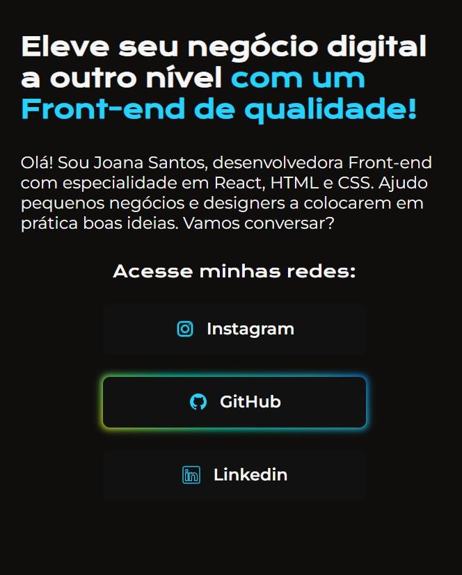
Css utilizando animação mais interativa no Button.
Como nao tem postar video o codigo acompanha um print
.apresentacao__links__link{
    display: flex;
    justify-content: center;
    gap: 16px;
    width: 378px;
    text-align: center;
    border-radius: 8px;
    cursor: pointer;
    outline: none;
    border: none;
    position: relative;
    font-size: 24px;
    z-index: 0;
    font-weight: 600;
    padding: 21.5px 0;
    text-decoration: none;
    color: #f6f6f6;
    font-family: "Montserrat", sans-serif;
}

.apresentacao__links__link img{
    width: 30px;
    position: relative;
}

.apresentacao__links__link:before{
    content: '';
    background: linear-gradient(45deg, #22d4fd, #ff7300, #fffb00, #00ffd5, #22d4fd, #002bff, #7a00ff, #ff00c8, #22d4fd);
    position: absolute;
    top: -2px;
    left: -2px;
    background-size: 400%;
    z-index: -1;
    filter: blur(5px);
    width: calc(100% + 4px);
    height: calc(100% + 4px);
    animation: glowing 20s linear infinite;
    opacity: 0;
    transition:  opacity .3s ease-in-out;
    border-radius: 10px;
}

.apresentacao__links__link:active {
    color: #000
}

.apresentacao__links__link:active:after {
    background: transparent;
}

.apresentacao__links__link:hover:before {
    opacity: 1;
}

.apresentacao__links__link:after {
    z-index: -1;
    content: '';
    position: absolute;
    width: 100%;
    height: 100%;
    background: #111;
    left: 0;
    top: 0;
    border-radius: 10px;
}

@keyframes glowing {
    0% { background-position: 0 0; }
    50% { background-position: 300% 0; }
    100% { background-position: 0 0; }
}