Desafio 1
import pandas as pd
vendas = pd.read_csv("https://raw.githubusercontent.com/alura-cursos/dataviz-graficos/master/dados/relatorio_vendas.csv")
vendas['data_pedido'] = pd.to_datetime(vendas['data_pedido'], format = '%Y-%m-%d')
vendas['data_envio'] = pd.to_datetime(vendas['data_envio'], format = '%Y-%m-%d')
vendas
df_ce = vendas.copy()
df_ce = df_ce.query('estado == "Ceará"')[['data_pedido', 'vendas']]
df_ce.set_index('data_pedido', inplace = True)
df_ce = df_ce.resample('2QE', closed = 'left').agg('sum')
df_ce = df_ce.reset_index()
df_ce
import matplotlib.pyplot as plt
fig, ax = plt.subplots(figsize = (12,4))
ponto = [df_ce['vendas'].idxmax(), df_ce['vendas'].idxmin()]
ax.plot(df_ce['data_pedido'], df_ce['vendas'], lw = 3, color = CINZA3, marker = 'o',
markersize = 9, markerfacecolor = CINZA2, markevery = ponto )
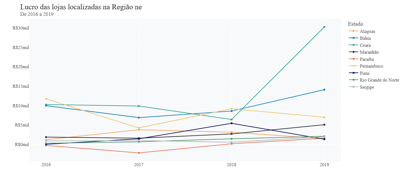
ax.set_title('Vendas por Semestre no Estado do Ceará (2016-2019)', fontsize = 18,
color = CINZA1, pad = 20, loc = 'left')
ax.xaxis.set_tick_params(labelsize=14, labelcolor = CINZA2)
ax.set_ylabel('')
ax.tick_params(axis="both", which="both", length=0)
ax.grid(axis = 'y', linestyle = '-' , color = CINZA4)
ax.set_frame_on(False)
plt.ylim(0, 1.5e5)
import matplotlib.dates as mdates
ax.xaxis.set_major_locator(mdates.MonthLocator(bymonth = [6,12]))
labels = ['1º Sem\n 2016', '2º Sem\n 2016', '1º Sem\n 2017', '2º Sem\n 2017',
'1º Sem\n 2018', '2º Sem\n 2018', '1º Sem\n 2019', '2º Sem\n 2019']
ax.set_xticks(ax.get_xticks())
ax.set_xticklabels(labels, ha = 'left')
x_max, x_min = [df_ce['data_pedido'].iloc[df_ce['vendas'].idxmax()], df_ce['data_pedido'].iloc[df_ce['vendas'].idxmin()]]
y_max, y_min = [df_ce['vendas'].max(), df_ce['vendas'].min()]
ax.text(x= x_max, y = y_max + 5000, s = f" As vendas alcançaram pela \n 1ª vez a faixa de R$ 120 mil \n no 2º Semestre de 2019.", fontsize = 10)
ax.text(x= x_min, y = y_min, s = f" O 1º Semestre de 2018 registrou \n vendas abaixo de R$ 20 mil", fontsize = 10)
fig = ax.get_figure()
Desafio 2
df_lucro_ne = vendas.copy()
df_lucro_ne = df_lucro_ne.query('regiao == "Nordeste"')[['data_pedido','estado', 'lucro']]
df_lucro_ne['ano'] = df_lucro_ne['data_pedido'].dt.year
df_lucro_ne.drop('data_pedido', axis = 1, inplace = True)
df_lucro_ne = pd.crosstab(index = df_lucro_ne['ano'], columns = df_lucro_ne['estado'],
values = df_lucro_ne['lucro'], aggfunc = 'sum')
df_lucro_ne = round(df_lucro_ne/1e3, 2)
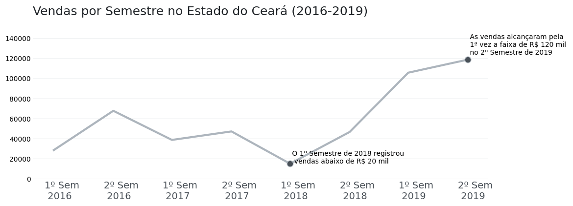
df_lucro_ne
import plotly.express as px
cores = [LARANJA1, AZUL2,VERDE2, CINZA1, VERMELHO1, AMARELO1 , AZUL1, VERDE1, CINZA3]
fig = px.line(df_lucro_ne, x = df_lucro_ne.index, y = df_lucro_ne.columns, markers = True,
labels = {'estado': 'Estado'}, color_discrete_sequence= cores)
fig.update_layout(width=1300, height=600, font_family = 'DejaVu Sans', font_size=15,
font_color= CINZA2, title_font_color= CINZA1, title_font_size=24,
title_text='Lucro das lojas localizadas na Região ne' +
'<br><sup size=1 style="color:#555655">De 2016 a 2019</sup>',
xaxis_title='', yaxis_title='', plot_bgcolor= CINZA5)
fig.update_yaxes(tickprefix = 'R$', ticksuffix = 'mil')
labels = ['2016', '2017', '2018', '2019']
fig.update_xaxes(ticktext = labels, tickvals=df_lucro_ne.index)
fig.update_traces(mode="markers+lines", hovertemplate = "<b>Período:</b> %{x} <br> <b>Lucro:</b> %{y}")
fig.show()