# Definindo a paleta de cores
AZUL1, AZUL2, AZUL3, AZUL4, AZUL5 = '#03045e', '#0077b6', "#00b4d8", '#90e0ef', '#CDDBF3'
CINZA1, CINZA2, CINZA3, CINZA4, CINZA5 = '#212529', '#495057', '#adb5bd', '#dee2e6', '#f8f9fa'
VERMELHO1, LARANJA1, AMARELO1, VERDE1, VERDE2 = '#e76f51', '#f4a261',	'#e9c46a', '#4c956c', '#2a9d8f'
Desafio 1
import pandas as pd
vendas = pd.read_csv("https://raw.githubusercontent.com/alura-cursos/dataviz-graficos/master/dados/relatorio_vendas.csv")
vendas['data_pedido'] = pd.to_datetime(vendas['data_pedido'], format = '%Y-%m-%d')
vendas['data_envio'] = pd.to_datetime(vendas['data_envio'], format = '%Y-%m-%d')
vendas.head()
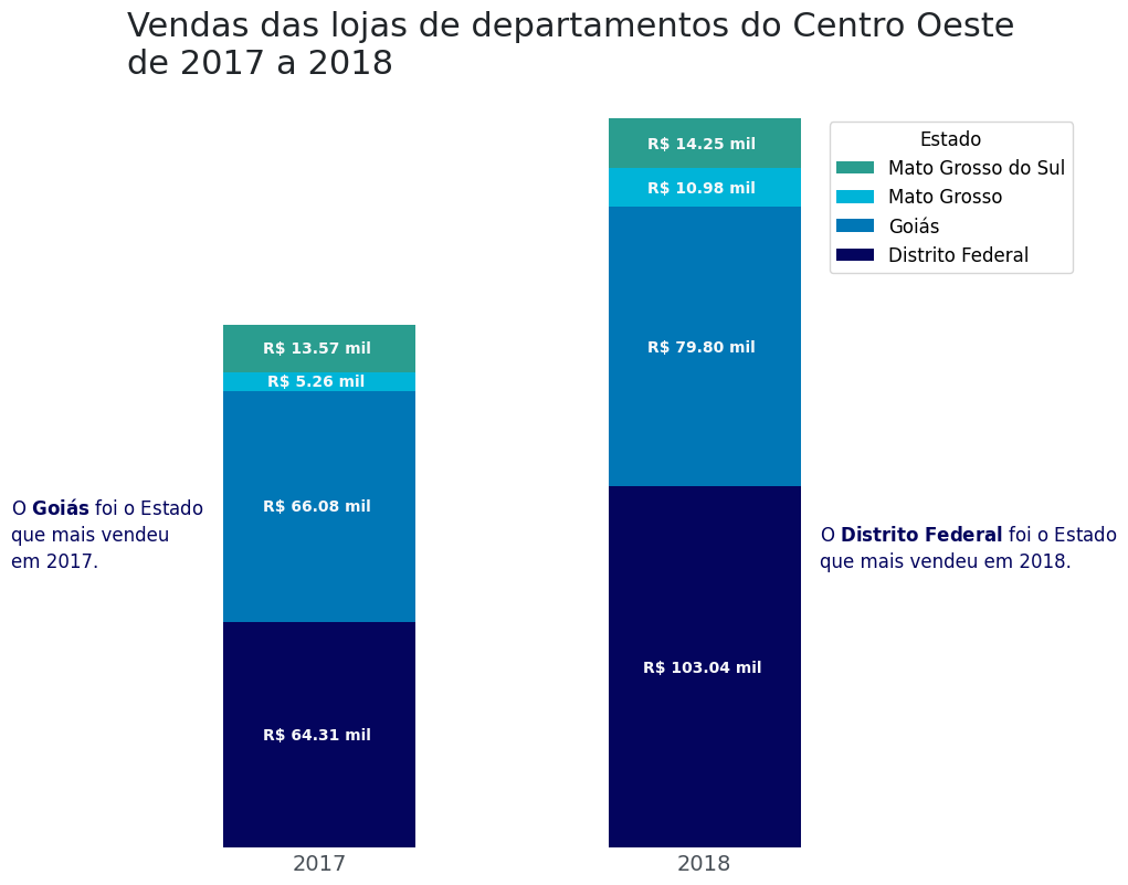
df_vendas_co = vendas.copy()
df_vendas_co = df_vendas_co[['data_pedido', 'vendas', 'estado', 'regiao']]
df_vendas_co['ano'] = df_vendas_co['data_pedido'].dt.year
df_vendas_co = df_vendas_co.query('regiao == "Centro-Oeste" and ano == [2017,2018]')
df_vendas_co.drop(['data_pedido', 'regiao'], axis = 1, inplace = True)
df_vendas_co = pd.crosstab(index = df_vendas_co['ano'], columns = df_vendas_co['estado'],
values = df_vendas_co['vendas'], aggfunc= 'sum')
df_vendas_co
cores = [AZUL1, AZUL2, AZUL3, VERDE2]
ax = df_vendas_co.plot(kind = 'bar', stacked = True, figsize = (9,9), color = cores)
ax.set_title('Vendas das lojas de departamentos do Centro Oeste\nde 2017 a 2018', loc='left', fontsize=22, color = CINZA1)
ax.set_xlabel('')
ax.set_ylabel('')
ax.set_yticklabels([])
ax.xaxis.set_tick_params(labelsize=14, labelcolor = CINZA2, rotation = 0)
ax.set_frame_on(False)
ax.set_frame_on(False)
ax.tick_params(axis="both", which="both", length=0)
ax.legend(bbox_to_anchor = (0.9,0.96), reverse = True, title = 'Estado', title_fontsize = 12, fontsize = 12)
for container in ax.containers:
labels = [f'R$ {valor.get_height()/1000:,.2f} mil '.replace(",",".") for valor in container]
ax.bar_label(container, label_type="center", labels = labels, size = 10, color = CINZA5, fontweight = "bold")
ax.text(1.3, 8e4,
'O $\\bf{Distrito \\ Federal}$ foi o Estado\n'
'que mais vendeu em 2018.',
fontsize=12,
linespacing=1.45,
color=AZUL1)
ax.text(-0.8, 8e4,
'O $\\bf{Goiás}$ foi o Estado\n'
'que mais vendeu\n'
'em 2017.',
fontsize=12,
linespacing=1.45,
color=AZUL1)
Desafio 2
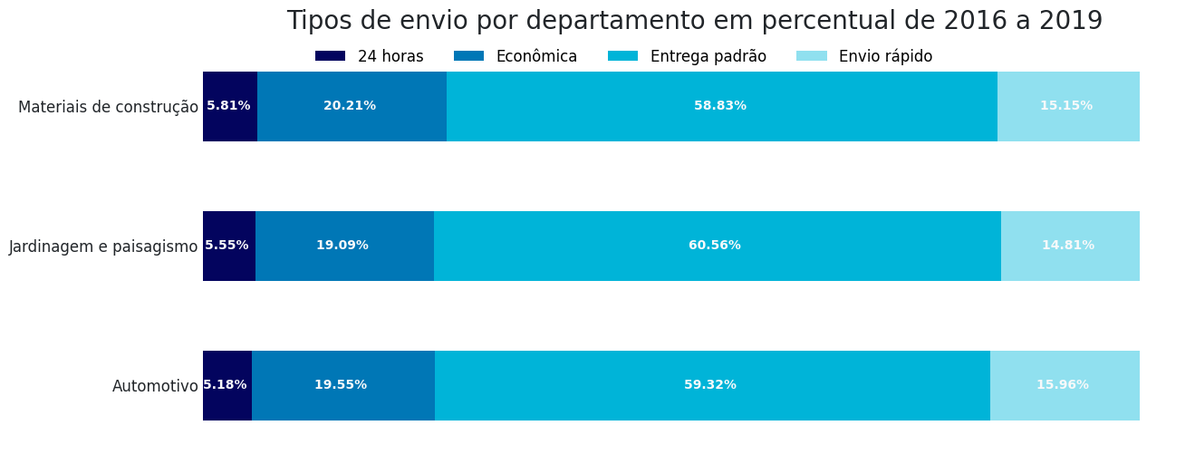
df_envio_depart = vendas.copy()
df_envio_depart = vendas[['modo_envio', 'departamento']]
df_envio_depart = pd.crosstab(index = df_envio_depart['departamento'], columns = df_envio_depart['modo_envio'], normalize = 'index')
df_envio_depart

cores = [AZUL1, AZUL2, AZUL3, AZUL4]

ax = df_envio_depart.plot(kind = 'barh', stacked =  True, figsize = (14,6), color = cores)
ax.set_title('Tipos de envio por departamento em percentual de 2016 a 2019', fontsize = 20, color = CINZA1)
ax.set_xlabel('')
ax.set_ylabel('')
ax.set_xticklabels([])
ax.yaxis.set_tick_params(labelsize=12, labelcolor = CINZA1)
ax.tick_params(axis="both", which="both", length=0)
ax.set_frame_on(False)

ax.legend(bbox_to_anchor = (0.1,0.9), title_fontsize = 10, fontsize = 12, ncol = 4, frameon = False)

for container in ax.containers:
  labels = [f'{valor.get_width()*100:,.2f}% '.replace(",",".") for valor in container]
  ax.bar_label(container, label_type="center", labels = labels, size = 10, color = CINZA5, fontweight = "bold")