import pandas as pd
import matplotlib.pyplot as plt
import seaborn as sns
url = 'https://raw.githubusercontent.com/alura-cursos/python_dados/refs/heads/main/Dados/apartamentos_aluguel.csv'
df = pd.read_csv(url)
df.head()
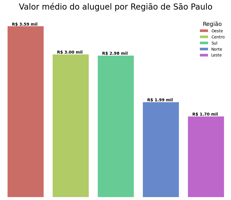
aluguel_regiao = df.groupby('Regiao')['Valor'].mean().reset_index().sort_values('Valor', ascending = False)
aluguel_regiao
fig, ax = plt.subplots(figsize = (10,8))
ax = sns.barplot(data = aluguel_regiao, x = 'Regiao', y = 'Valor', palette = 'hls', hue = 'Regiao', legend = True)
ax.set_title('Valor médio do aluguel por Região de São Paulo', fontsize = 20, pad = 20)
ax.set_xticklabels([])
ax.set_xlabel('')
ax.set_yticklabels([])
ax.set_ylabel('')
ax.tick_params(axis='both', which='both', length=0)
ax.set_frame_on(False)
ax.legend(frameon = False, title = 'Região', title_fontsize = 14)
for container in ax.containers:
labels = [f'R$ {valor.get_height()/1000:,.2f} mil '.replace(',','.') for valor in container]
ax.bar_label(container, label_type='edge', labels = labels, size = 10, fontweight = 'bold')
plt.show()